02/ Intuitions

CONTEXTE MOOD

intuitif

INT_INSIGHT1
#exceptionnalathletes
For most athletes, being selected for the Olympic Games is a true promise for glory. For others, surviving in refugee camps, for those without a flag to defend, who can only compete under that of the Olympic Athlete Refugee Team (A.R.T.), it is a visa for freedom, a door that opens out to the future.
#random
A demonstration on how sound can be used to create beautiful patterns.
INT_INSIGHT3
#designintuitif
‘’Intuitive design is at the heart of what we do at Rapha. We were certainly delighted when Robyn asked us if she could use our surplus materials to create new pieces,” says Ger Tierney, Deputy Creative Director at Rapha. This sentiment is shared by Robyn, who feels it is a “major step for her young company to collaborate with Rapha”.
No need to program, parameterizing or optimizing. The connected watch has been left at home, where all notifications of the coach app are in silence mode. It’s time to get back to natural effort, with confidence in our sensations. Only with one’s body and mind. What a sense of freedom. Finish rather than win. It feels so good, able to go farther, faster, for longer.
Pas de programme, on ne paramètre pas et on n’optimise rien : la montre connectée est restée à la maison et les notif’ de l’appli coach sont en silencieux. C’est un retour à l’effort naturel, on fait confiance à ses sensations. Seul avec son corps et son esprit. Un goût de liberté. Finisher plutôt que winner. Et si on se sent bien on ira plus loin, plus vite, plus longtemps.

#boldmates #twinmates

SPORT MOOD

FINISHER

INT_MOODBOARD

COLOR MOOD

GOLDEN BEIGES AND KHAKIS

The core of the range consists of shades of golden beige and warm khaki, absolutely necessary to reach the high performance imagined in a salt or sand desert. Ochre is the bright shade needed to bring technical prowess to the harmonies that go with charcoal grey and a cold, light grey. Reddish brown and smoked purple add a precious and noble touch to such colour associations.
Le cœur de la gamme se compose d’un camaïeu de beiges dorés et de kakis chauds, indispensables pour accomplir cette performance qu’on imagine en plein désert, de sel ou de sable. L’ocre est le vif qui apporte de la technicité aux harmonies accompagné du gris carbone et du gris clair froid. Le brun rougi et le violet fumé confère aux associations un côté précieux et noble.
INT_COLOR RANGE

GRAPHIC MOOD

NATURAL

COMPONENT MOOD

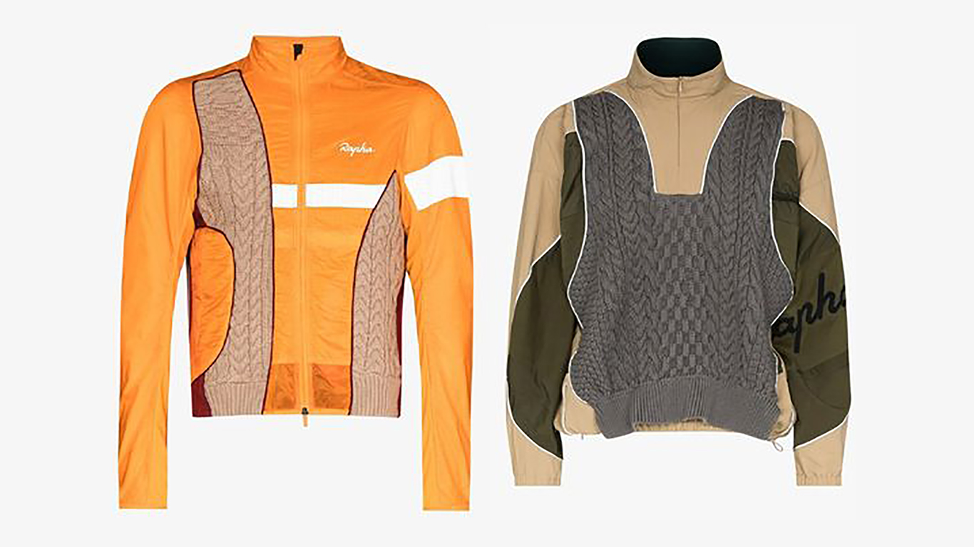
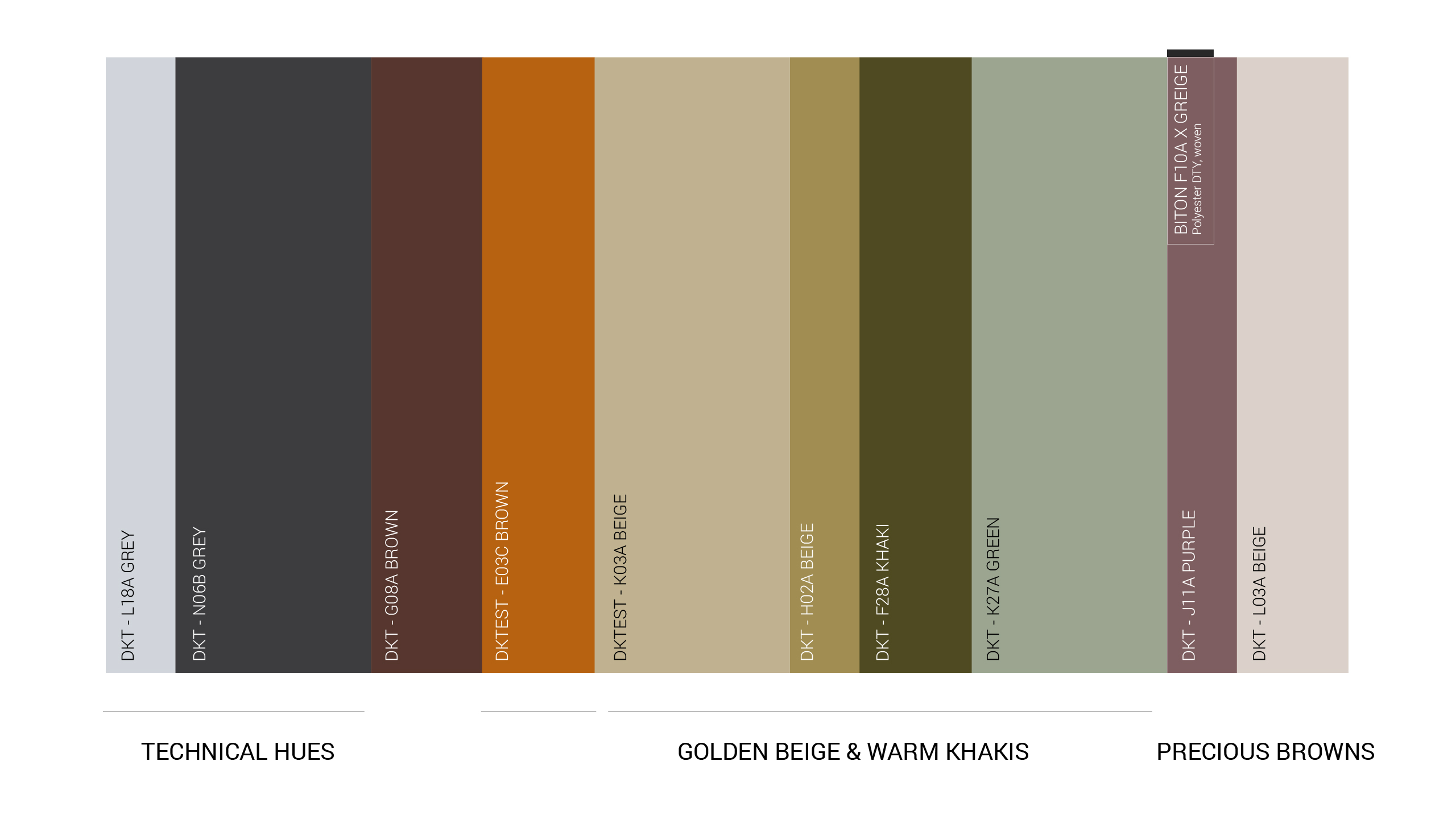
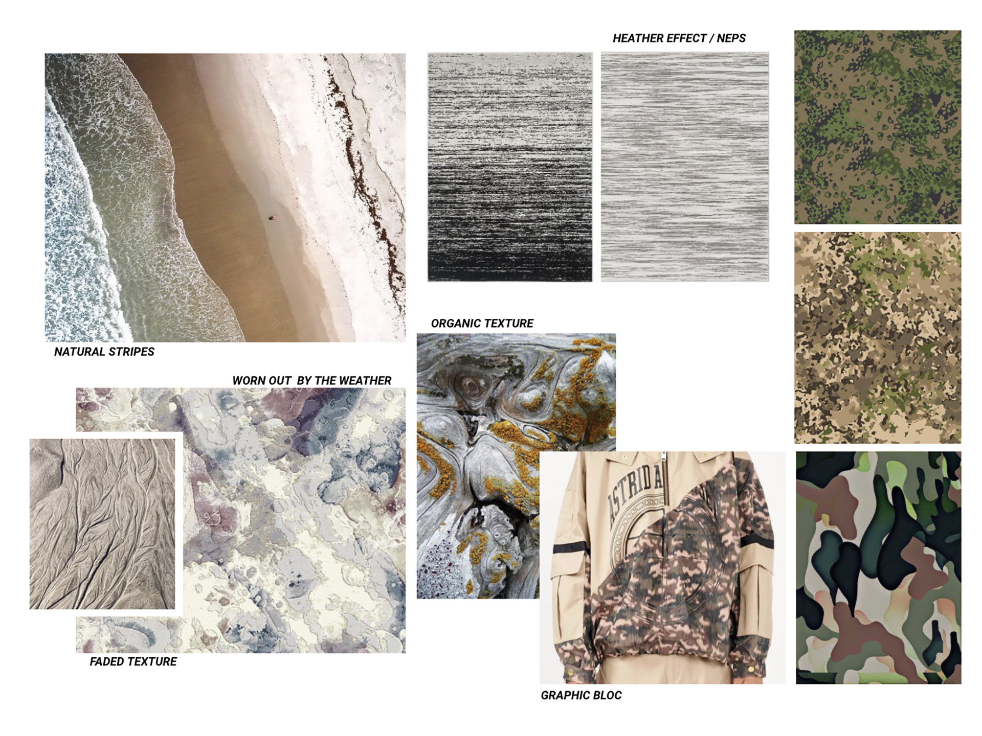
A getaway. This is what we are all looking for, whether it be mental, visual or through high performance. We forget all that is superfluous to focus on natural, sandy textures with slub yarn and crinkled effects. Donned for all occasions, how soft to the touch, yet technical, reassuring and effective, to conduct our expedition ever so peacefully. Sometimes flecked, sometimes washed out, as if used, forever irregular, taffetas and waffled effects take us into an internal quest, with us toward the goal to be reached, ever so lightly.
L’évasion… c’est ce que l’on recherche tous, qu’elle soit mentale, visuelle ou à travers la performance. On oublie le superflue pour se concentrer sur des textures naturelles, sableuses, avec des effets de fils flammés et des aspects froissés. Habillés pour toutes les éventualités, les touchés sont doux mais techniques, rassurants et performants, pour mener notre expédition en toute tranquillité. Parfois chinés, parfois délavés, comme usés, toujours irréguliers, les taffetas et les effets gaufrés nous plongent dans une quête intérieure, et nous accompagnent vers le but à atteindre, en légèreté.